|
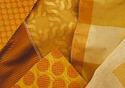 Monochromatic
combinations Monochromatic
combinations
One-color combinations,
referred to as monochromatic, may sound boring, but when planned
well, can be serene and elegant. The key to success with a monochromatic
scheme is to use materials that are similar in value (lightness
or darkness) and intensity (brightness or dullness). You won't
be able to find materials of identical value and intensity, and
that's for the best because a monochromatic scheme often cries
out for a little variation.
You can add interest
to a monochromatic scheme with true neutrals. Or your one-color
combination may be based on a neutral, such as gray, with accents
of other neutrals.
Analogous Combinations
These harmonious combinations
consist of colors that lie side by side on the color ring. Red,
red-orange and orange are analogous (or related), and so are
blue, blue-violet and violet. The key to an analogous scheme
is a common color. In the first example, the common color is
red (orange is half red). In the second, it's blue (violet is
half blue). If you look at related colors on the color ring,
you'll also see that they usually have similar visual temperatures,
mostly cool or mostly warm.
As with a one-color combination,
an analogous scheme gains interest from a lively mix of patterns
and textures. To avoid monotony, vary the quantities of the colors
and make one an intense accent. Wood, art, and accessories can
add impact to such a room.
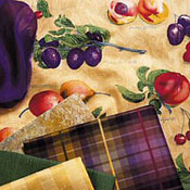 Complex Combinations Complex Combinations
Complex schemes consist
of colors spaced around the color ring in a variety of arrangements.
Teal, magenta and mango (intense versions of blue-green, red-violet
and yellow-orange) are equidistant on the color ring, in a combination
known as a "triad." A four-color combination of equidistant
colors, such as green, red, yellow-orange and blue-violet, is
known as a "tetrad." Complex color schemes are pleasing
because they automatically balance visual temperature. To help
you imagine these combinations, you might try isolating the colors
on one of the color rings while covering the others. For example,
using Color Ring #2, cover all of the colors except orange, green,
and violet.
Complementary and complex
color combinations are trickier than monochromatic or analogous
schemes. Use the tips that follow for help.
 Complementary
Combinations Complementary
Combinations
Complementary combinations
are made up of colors that lie directly opposite each other on
the color ring. Red and green are complements, as are yellow-orange
and blue-violet. The opposing color pairs can be approximately
opposite, as well: Sage green (a yellow-green) combines beautifully
with violet, even though they are not direct complements.
In practice, any color
that lies on the opposite side of the color ring will balance
and enliven your main color. Blue and orange may look harsh together,
but blue works well with yellow, which is on the warm side of
the color ring. When you combine complementary colors, feel free
to wander around the ring a bit. The effect is still harmonious.
In fact, sometimes it's more interesting when the colors are
not direct complements.

Schemes made up of
complementary primaries and secondaries, such as yellow and violet,
seem visually stronger than those consisting of intermediate
colors, such as blue-violet and yellow-orange. The presence of
two colors in the intermediate hues softens the contrast.

|


 Monochromatic
combinations
 Complex Combinations
 Complementary
Combinations
