 |
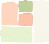
Palette #1
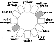
Complementary pink (a light value of red) and green are a
perennial favorite. When you work with colors opposite on the
color ring, choose low-intensity versions to soften the contrast.
Varying the values, even a little, adds depth to a scheme. A
near-white is ideal for walls.
|
 |
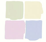 |
Palette #2
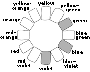
Low-intensity colors on the cool side of the color ring are
related, yet different enough to be interesting. Violet, an effective
bridging color, adds a little warmth to cool blue and green.
A grayish green is a harmonious companion color.
|
 |
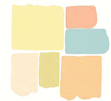 |
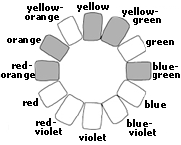
Palette #3
Blue-green and peach, near complements on the color ring,
benefit from unexpected yellow-green. Coral (a light value of
red-orange) stretches the scheme even farther and keeps it from
looking like a color formula. Pale peach and soft yellow - both
appropriate colors for walls or trim - lighten the palette.
|
 |
 |
Palette #4
Analogous colors ranging from pale yellow-orange through minty
green are elegant and understated. A neutral gray lends sophistication
and pushes the scheme beyond "pastel." This palette
shows how disparate hues become kindred colors when they are
similar in value. Slight differences in intensity add an element
of surprise.
|
 |
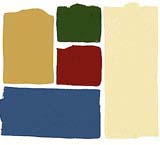 |
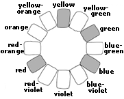
Palette #5
Primary red, blue and yellow, known as a triad, work well
when the colors are dark in value and low in intensity. In this
palette, brick red, cadet blue and palomino gold set a quiet
mood. Green cools the warm red and gold; light khaki is appropriate
for walls or trim.
|
 |
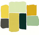 |
Palette #6
A limited palette of analogous colors looks complex when the
values and intensities vary. The color range shown here is quite
narrow, from warm ocher yellow through cooler greens. Dark gray
and glen green anchor the scheme. The lighter values are appropriate
for walls.
|
 |
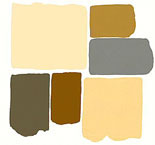 |
Palette #7
New neutrals in a mix of light, medium and dark values make
up a warm palette. Closely related values of toast and charcoal
repeat the colors for a pleasing visual rhythm. Oatmeal and chamois
are suited to walls or trim, browns and grays to furnishings
and floor.
|
 |
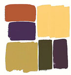 |
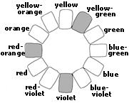
Palette #8
A six-color palette, loosely based on a near-triad of yellow-green,
red-orange and violet, is diverse and complex. Aubergine and
plum temper the warm olive green, gold and russet. For walls,
use either of the lightest values, or seek out lighter, low-intensity
versions of the darker hues.
|
 |
 |
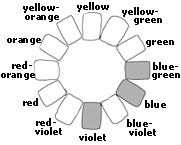
Palette #9
A light-value, clear violet adds an element of surprise to
a classic blue and green combination. Pearly gray, a true neutral,
spaces out the color, while a dark-value, low-intensity blue
grounds the scheme. For a light look, consider gray walls or
lighter versions of violet, green, or blue.
|
 |
 |
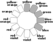
Palette #10
A palette of yellow, blue and green is always fresh and summery.
Varying the greens from yellow-green through green takes the
scheme beyond the predictable. Slightly different blues - one
true, the other closer to aqua - show that color combinations
are often more interesting when you "wander around the color
ring" a bit.
|
 |
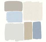 |
Palette #11
Warm and cool grays harmonize with icy blue-grays. Consider
using the light gray on walls, the lightest gray on trim. A cool
blue-and-gray palette benefits from the warmth of wood furniture
or wood floors.
|
 |
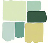 |
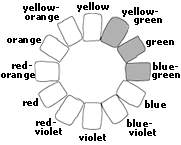
Palette #12
An analogous combination begs for a range of values and intensities,
as in this yellow-green through blue-green scheme. A low-intensity
yellow-green warms up the cooler hues. The light and medium values
are suited to walls; the darkest green is a natural for furnishings.
|
 |
 |
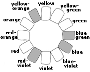
Palette #13
Intense, high-contrast colors are energetic and visually exciting.
Two warm and two cool hues balance the visual temperature in
this vibrant scheme. When you use intense colors, be sure to
vary the quantities. Black and white, true neutrals, provide
visual relief in a high-contrast room.
|
 |
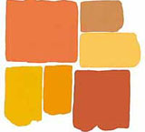 |
Palette #14
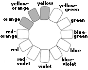
Analogous hues ranging from yellow-orange through red-orange
couldn't be warmer. Varying the values and intensities just a
little quiets the scheme and provides needed visual relief. Copper,
a dark value of orange, tones down the brilliant colors. Use
the lighter values for walls and trim, the darker values for
furnishings.
|
 |
 |
Palette #15
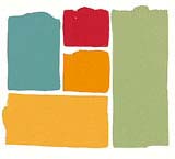
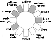
Near-complements of blue-green and red are tempered by a grayed
yellow-green. Intense orange and yellow-orange push the scheme
toward the warm side of the color ring. Consider lighter values
of the warmer hues for walls, darker values of the cool colors
for floors, and a mix of colors for furnishings.
|
 |
 |
Palette #16
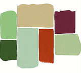
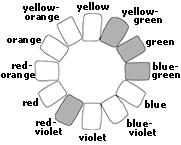
Complementary yellow-green and red-violet are stretched to
include truer and bluer greens. A neutral the color of putty
is appropriate for walls or floors, as are the light-value greens.
Low-intensity red-violet is a natural for furnishings, with russet
and green as accents.
|
 |


